K Health
Infographics
Utilizing surveys and clinical insights to chart user's health and habits
Overview
Data is a core element of the K Health brand. The AI-powered symptom checker is built off of millions of anonymized medical records, which provides doctors and users with information about the diagnoses and treatments of others with similar symptoms and conditions. With this in mind, and access to all this information, there’s an effort from the content team to focus on data-driven storytelling.
Newsletter
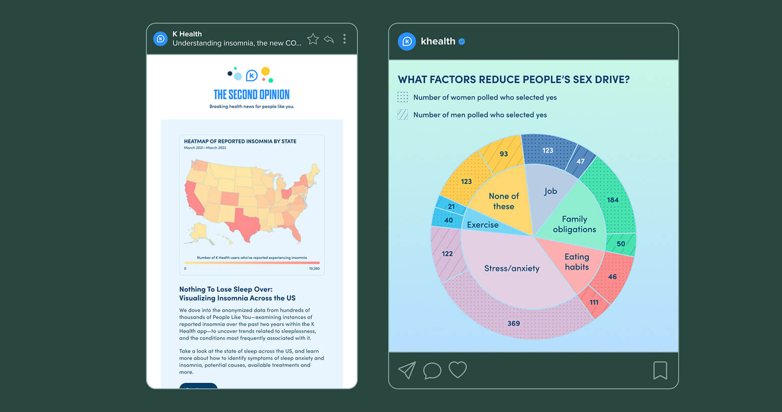
One method used to tell these stories is K Health’s newsletter, The Second Opinion. Working with K's data science team, the Senior Manager of Content writes articles analyzing trends over time in symptoms reported by users and I create accompanying infographics.
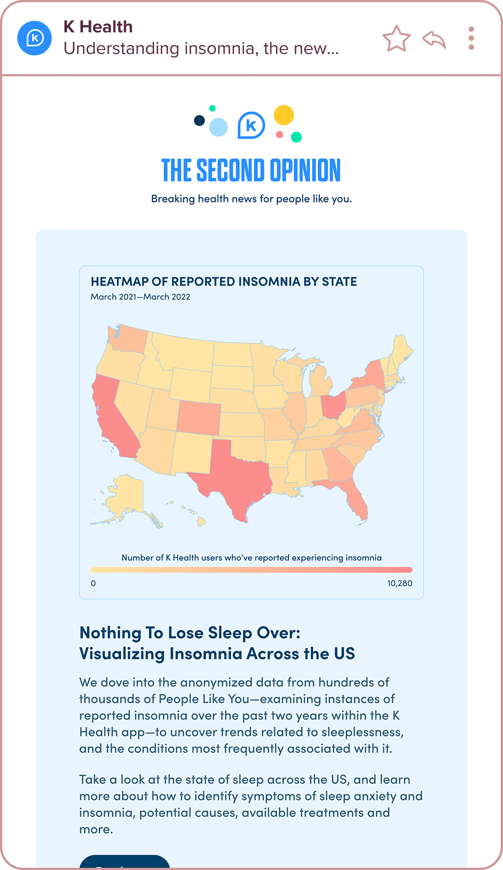
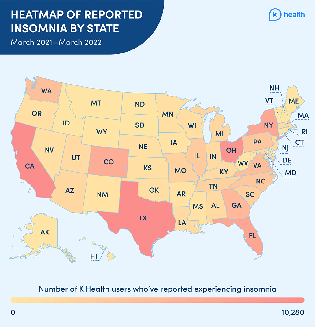
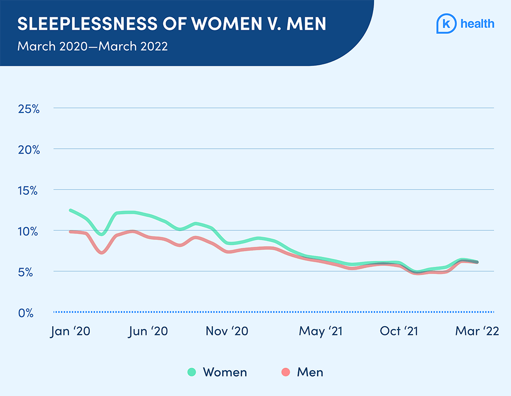
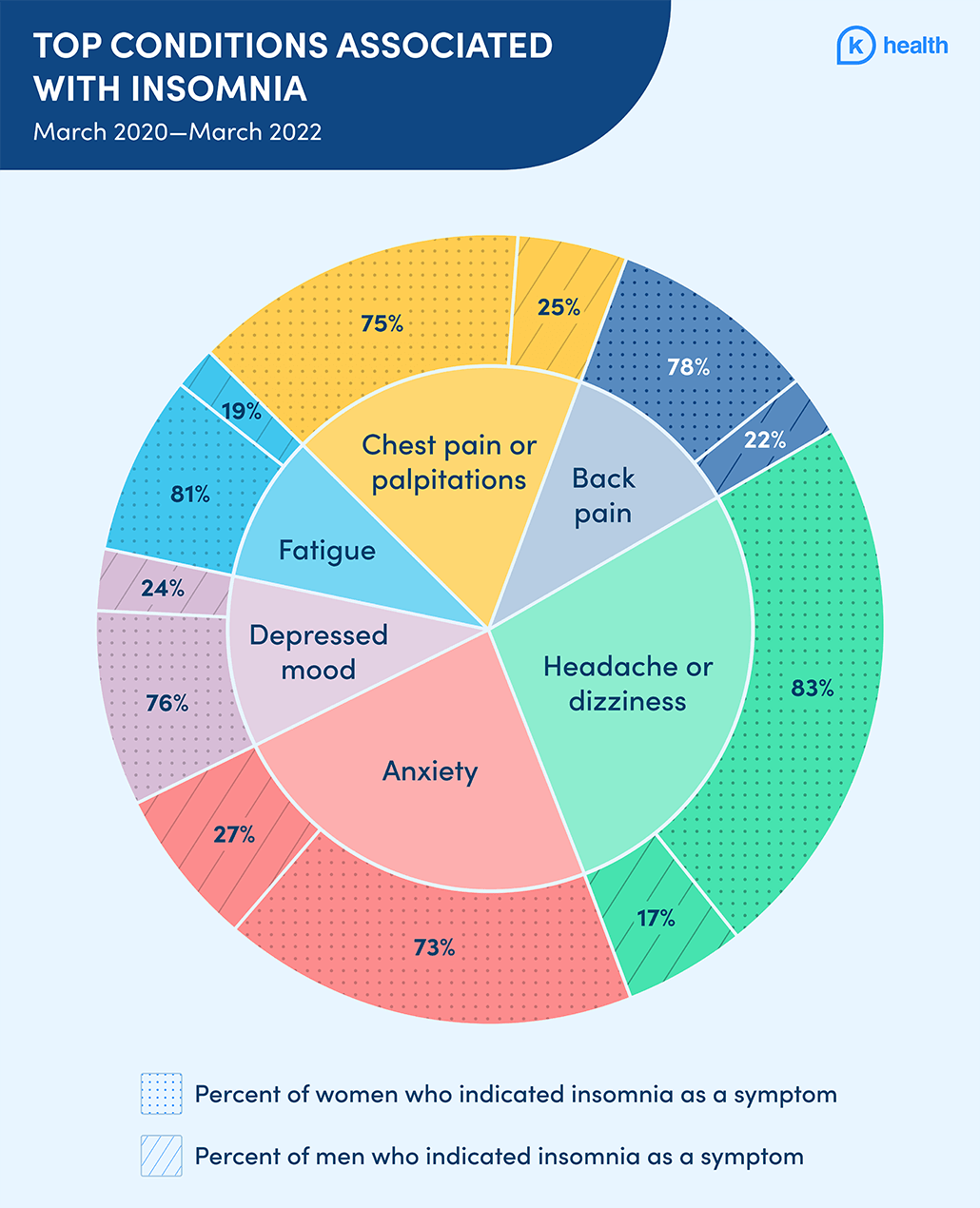
Insomnia newsletter and article versions of the infographics
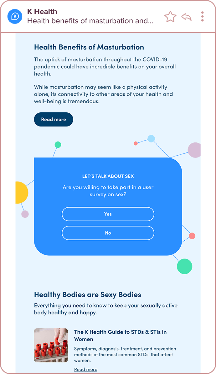
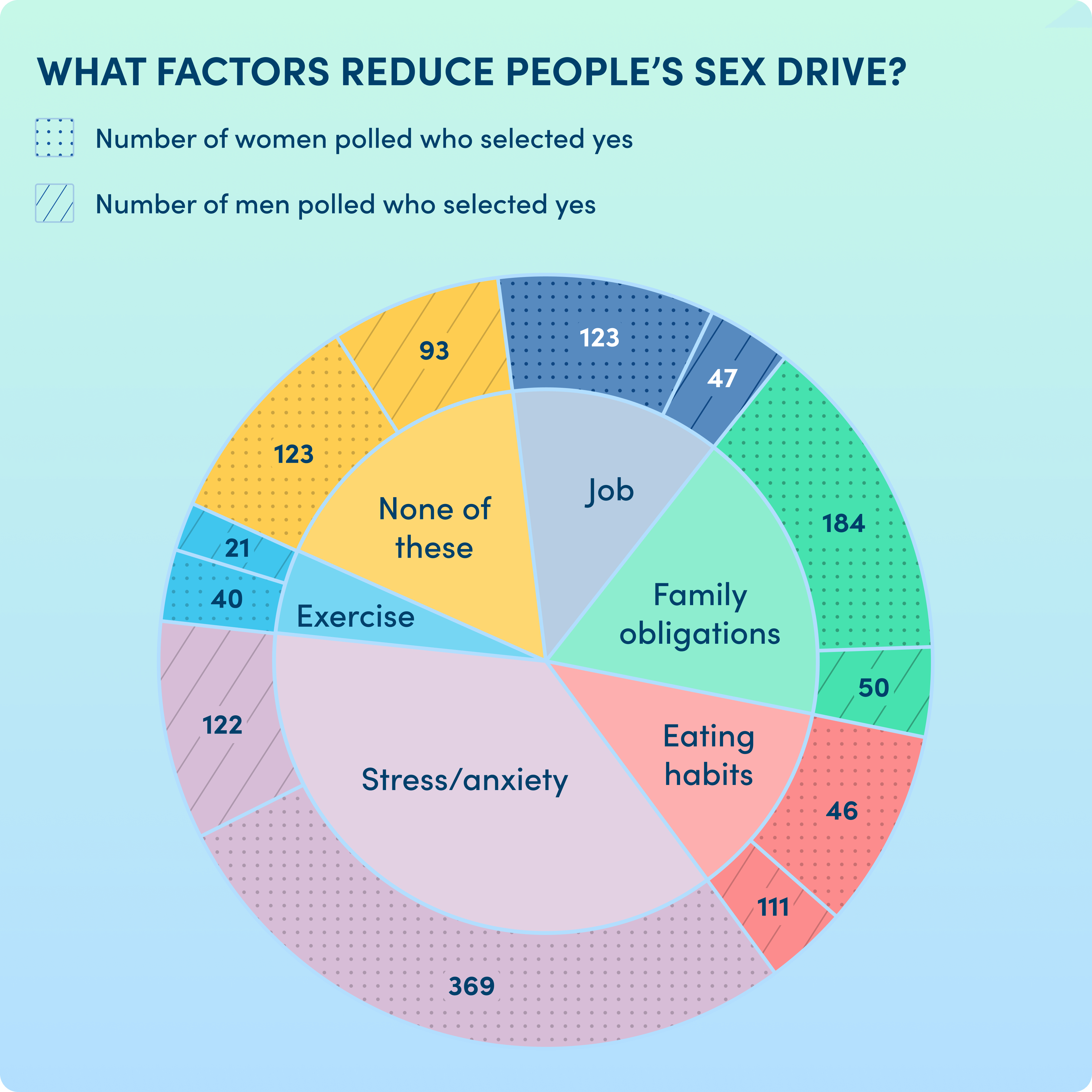
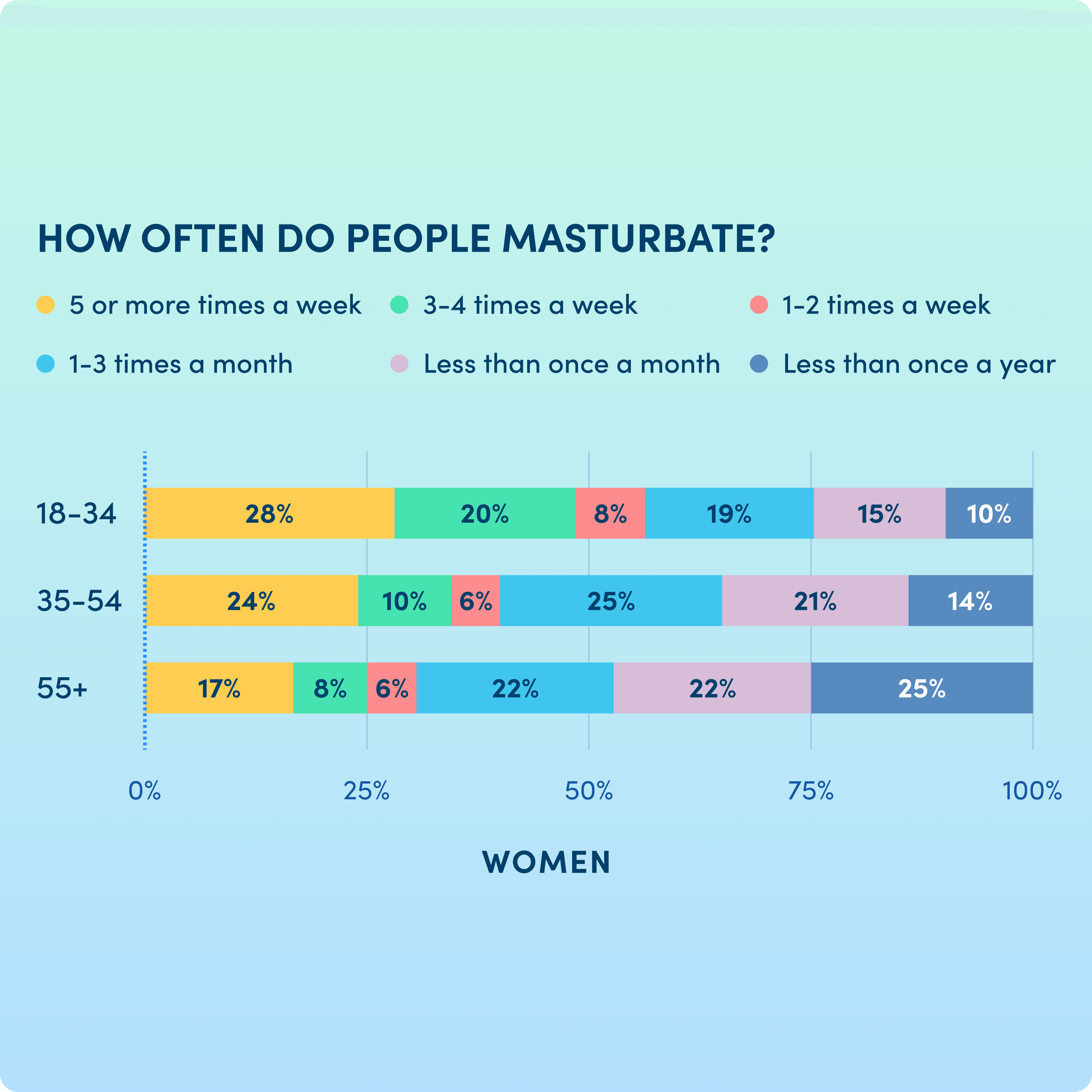
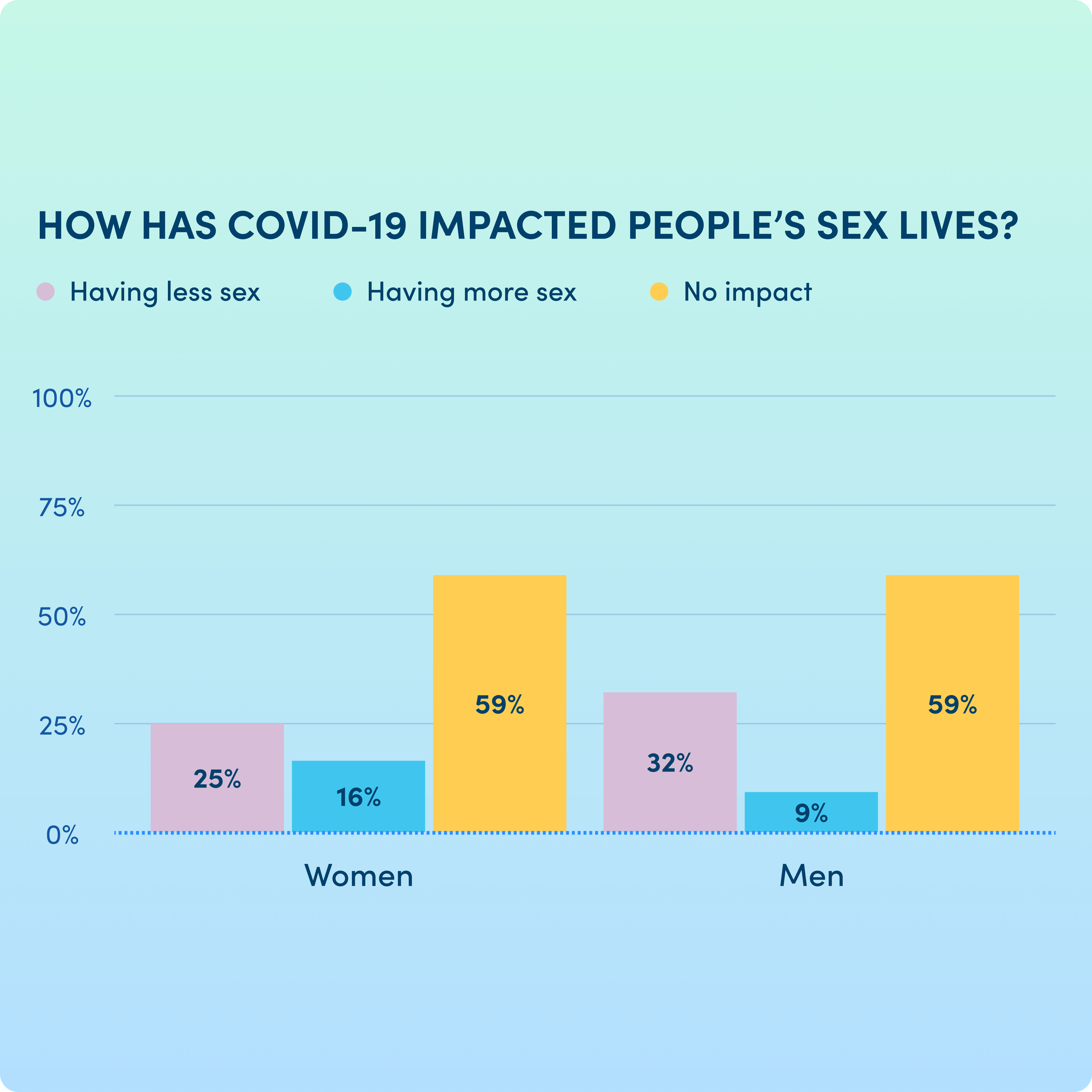
Building off of the clinical insights, we decided to start polling our users. We sent out multiple surveys during COVID, evaluating people’s opinions on topics like vaccination and return to office, but the most engaged with topic was the Valentine’s Day-themed survey about sex.
For all newsletter sends, I designed and built the newsletters, themed the Typeform to match the K Health brand, assisted with calculating all the data, and created infographics for use within the emails, articles, and on social media.
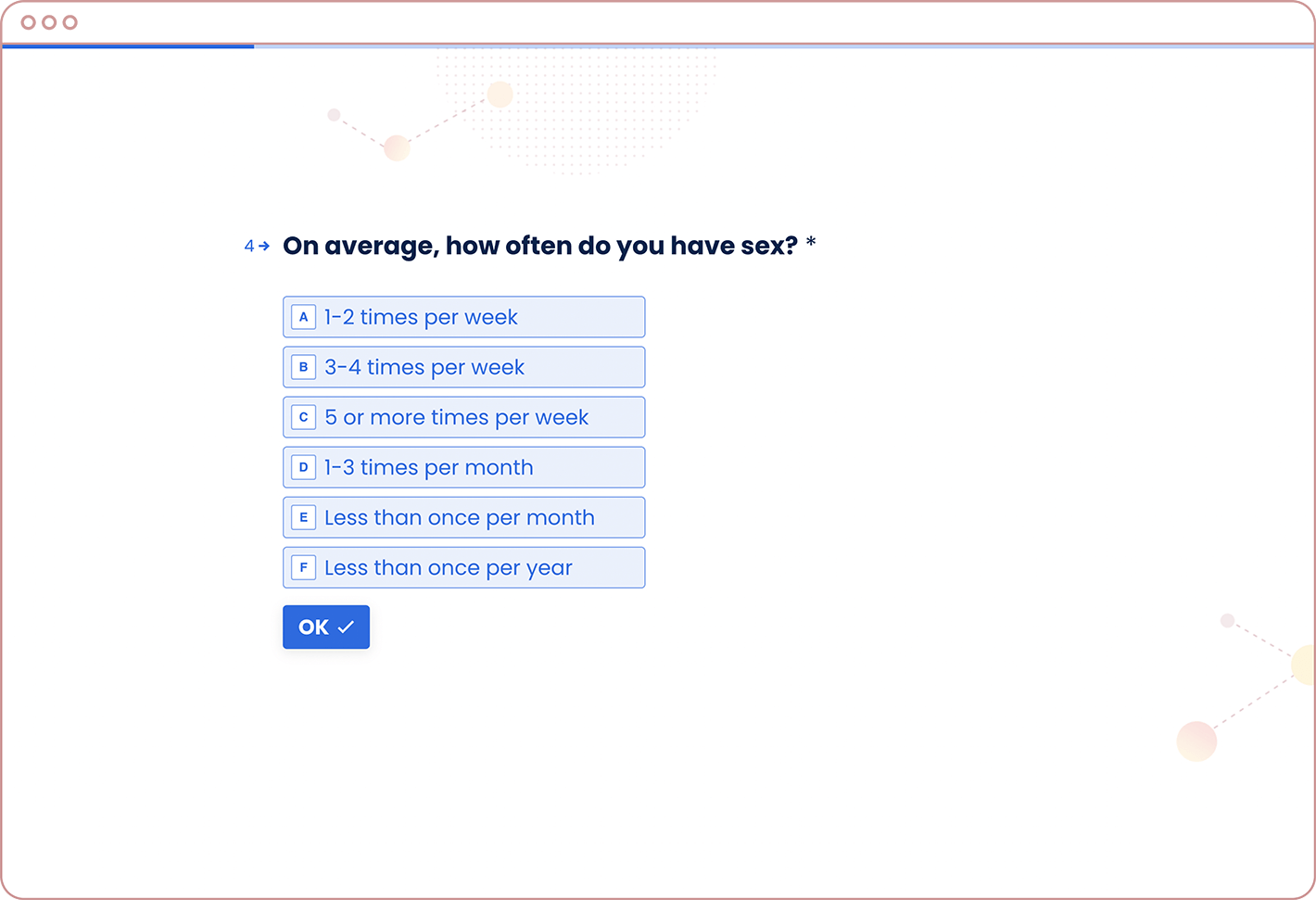
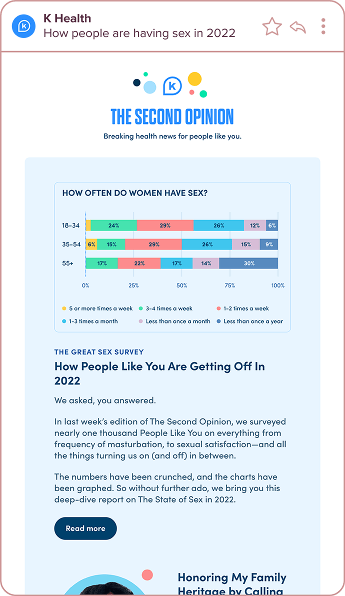
Initial survey newsletter, typeform, and results newsletter
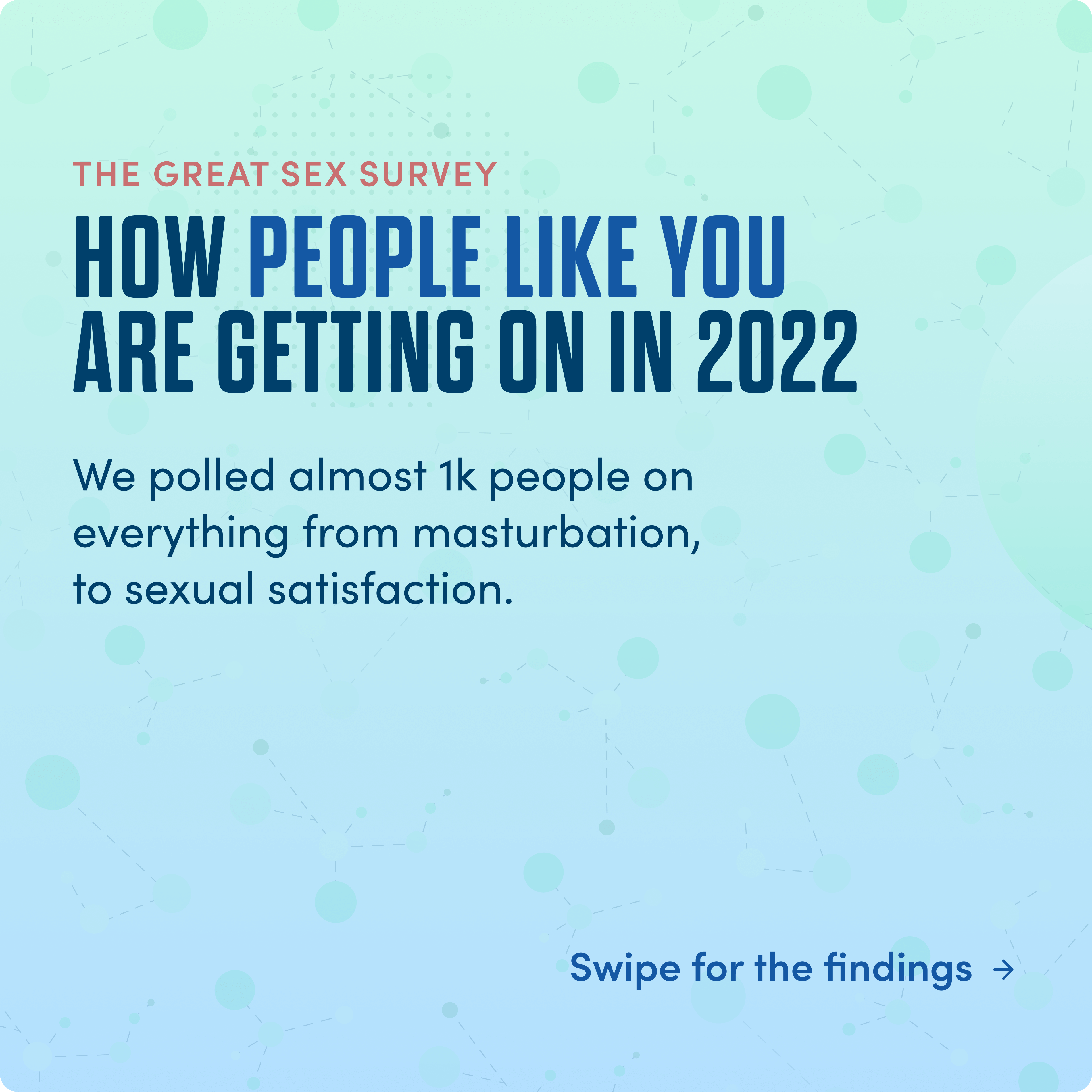
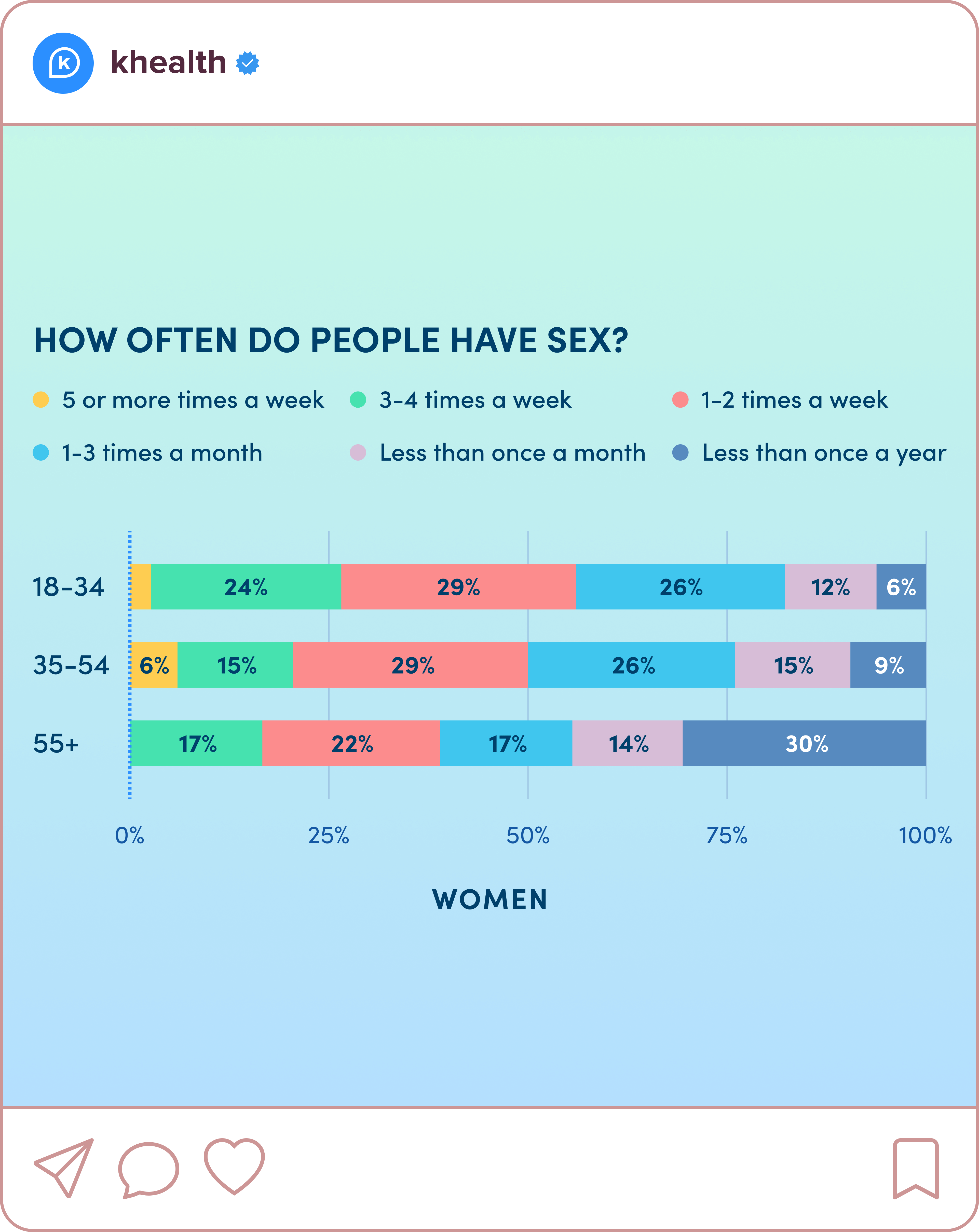
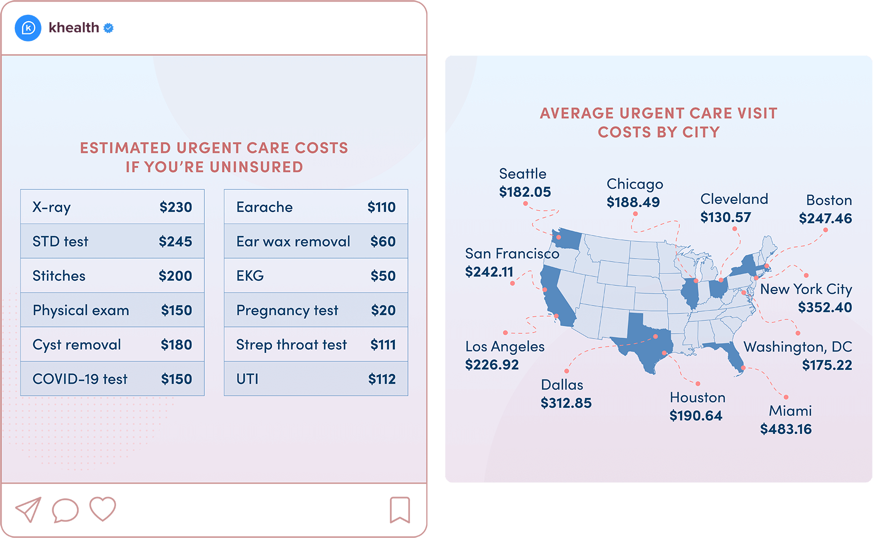
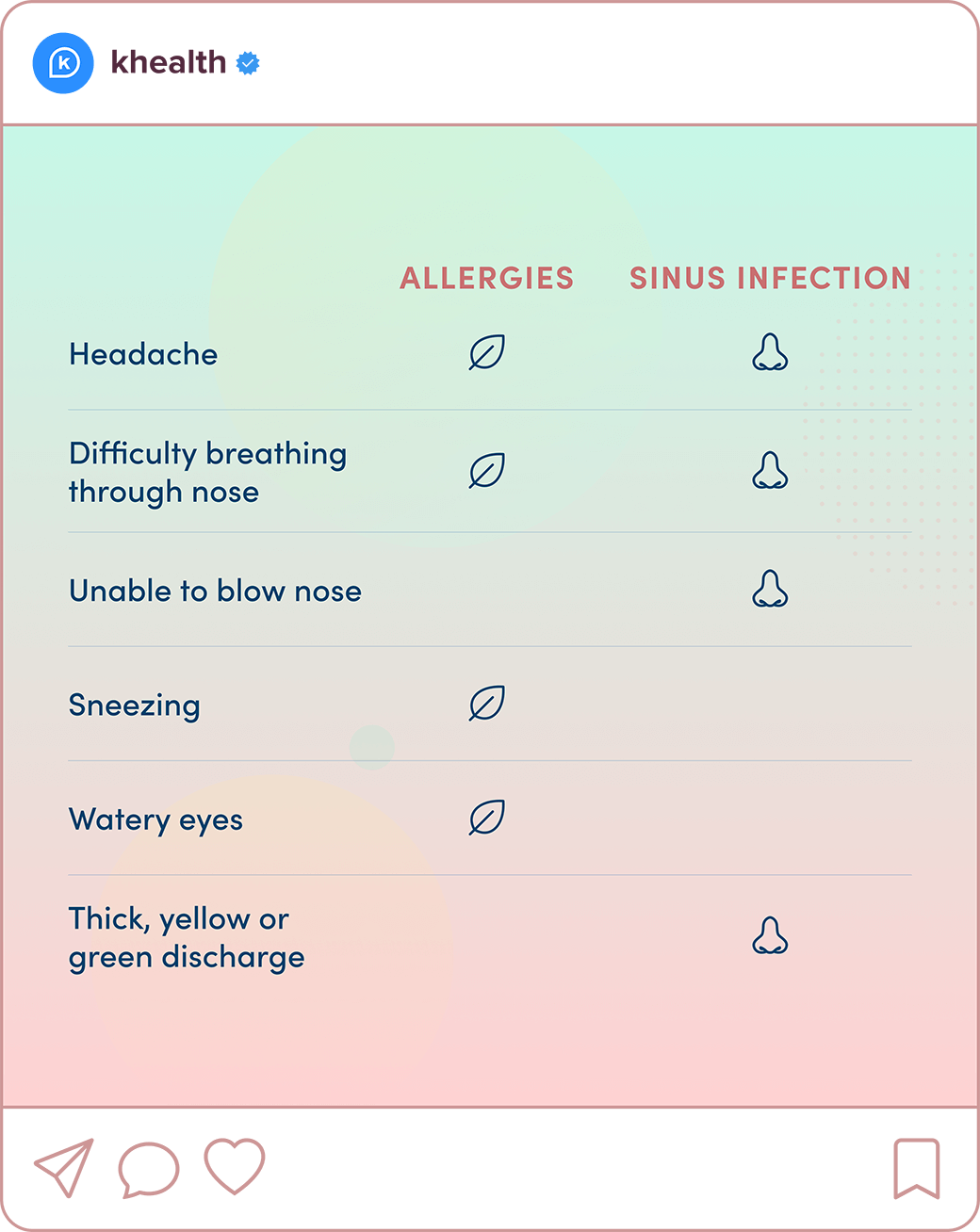
Instagram versions of the infographics
Social media posts
For smaller data stories and to educate users, I also create infographics solely for use on social media.