K Health
Website
Helping users find the care they need through organic and paid search
Overview
Throughout my time at K Health, improving our website was a top priority. With a wide range of services, the goal was not only to increase conversion rate, but also better route our users to the care they were looking for, all while also improving and optimizing the design alongside our evolving brand guidelines.
Paid landing pages
Working closely with the Marketing Team and a Data Analyst, we created landing pages for both generic services and specific conditions to guide users that are searching for care. Routing users directly to a landing page instead of our home page streamlined the process for users that knew their condition and were seeking immediate care. We heavily tested copy and imagery to increase conversion rate, and also used paid search as a testing space for new page designs that we could incorporate back into the rest of the site.
Primary Care landing pages
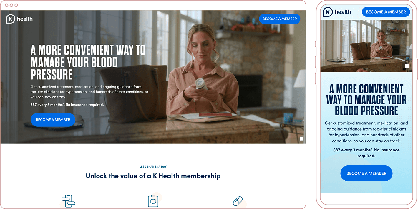
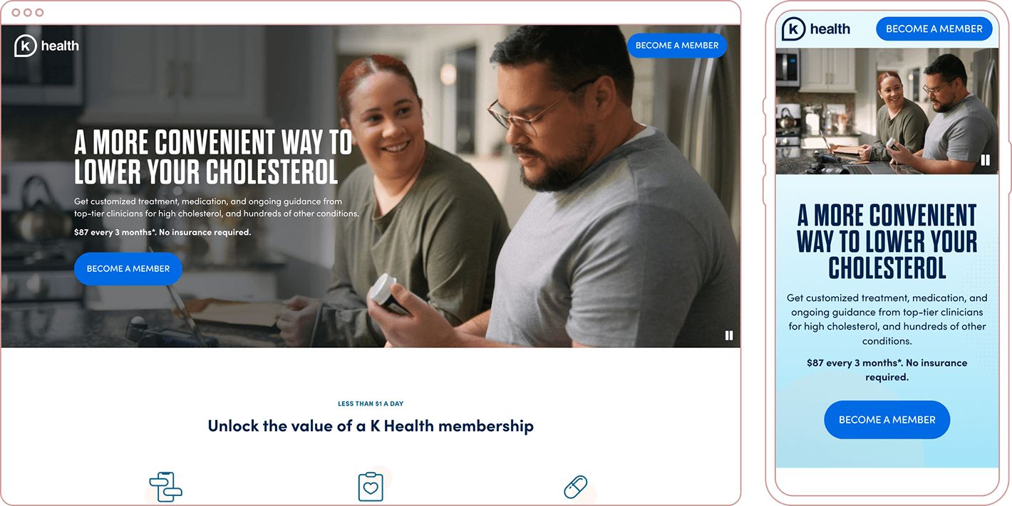
Alternate hero sections for condition-specific versions of the pages
Medical Weight Management landing page
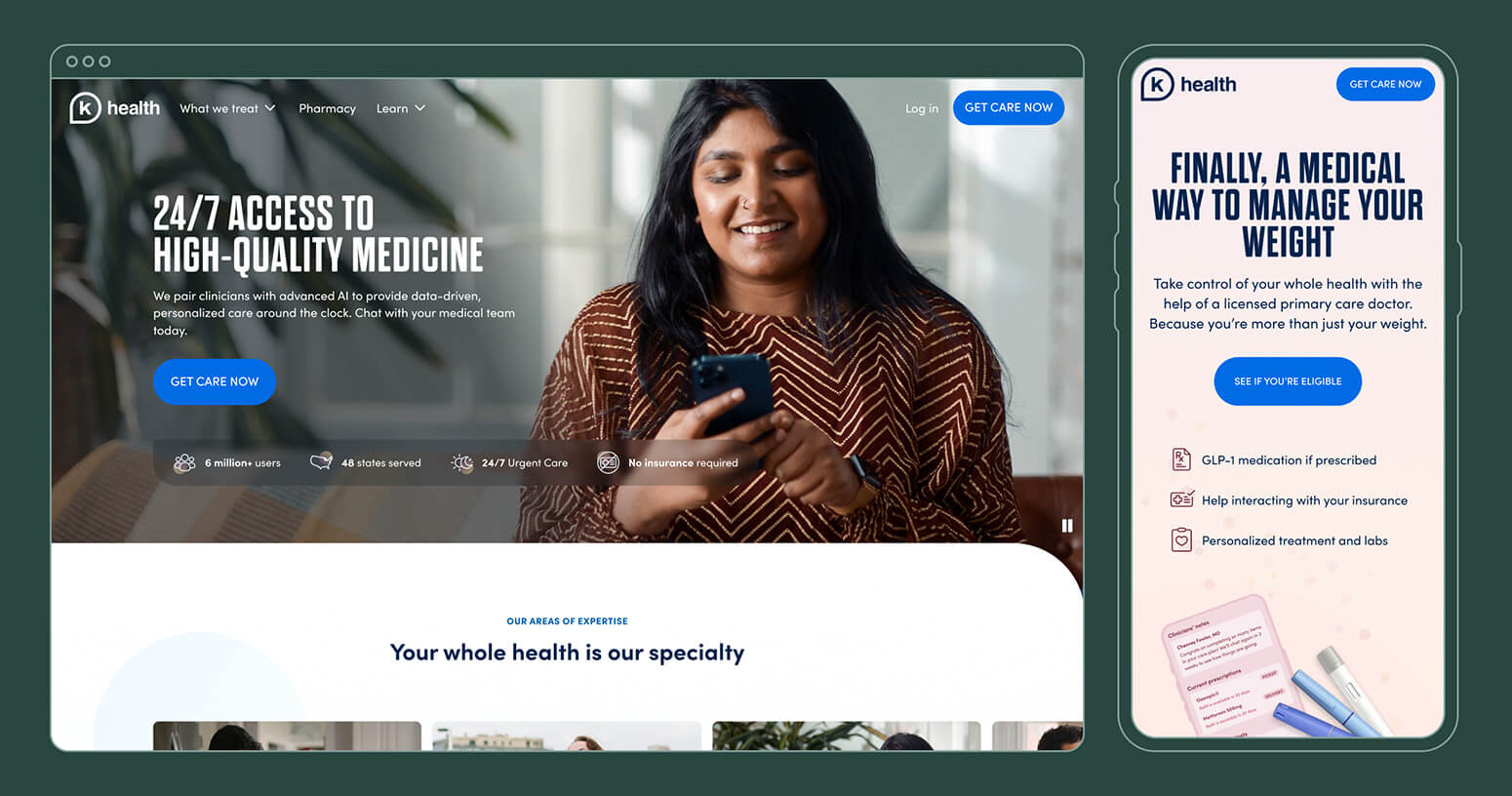
Home page
Seeing a decrease in drop off and an increase in click-through rate, we used our learnings to implementing similar changes on the main site, beginning with the home page. K Health's services and business direction had grown and shifted throughtout the years, and the home page no longer reflected what K Health had to offer to its users. With a wide array of services, how could we direct users that came to khealth.com organically, and maybe didn't know what specifically was ailing them, to the care they needed?
Additionally, we also needed to include sections on the home page that built trust in our technology and providers.
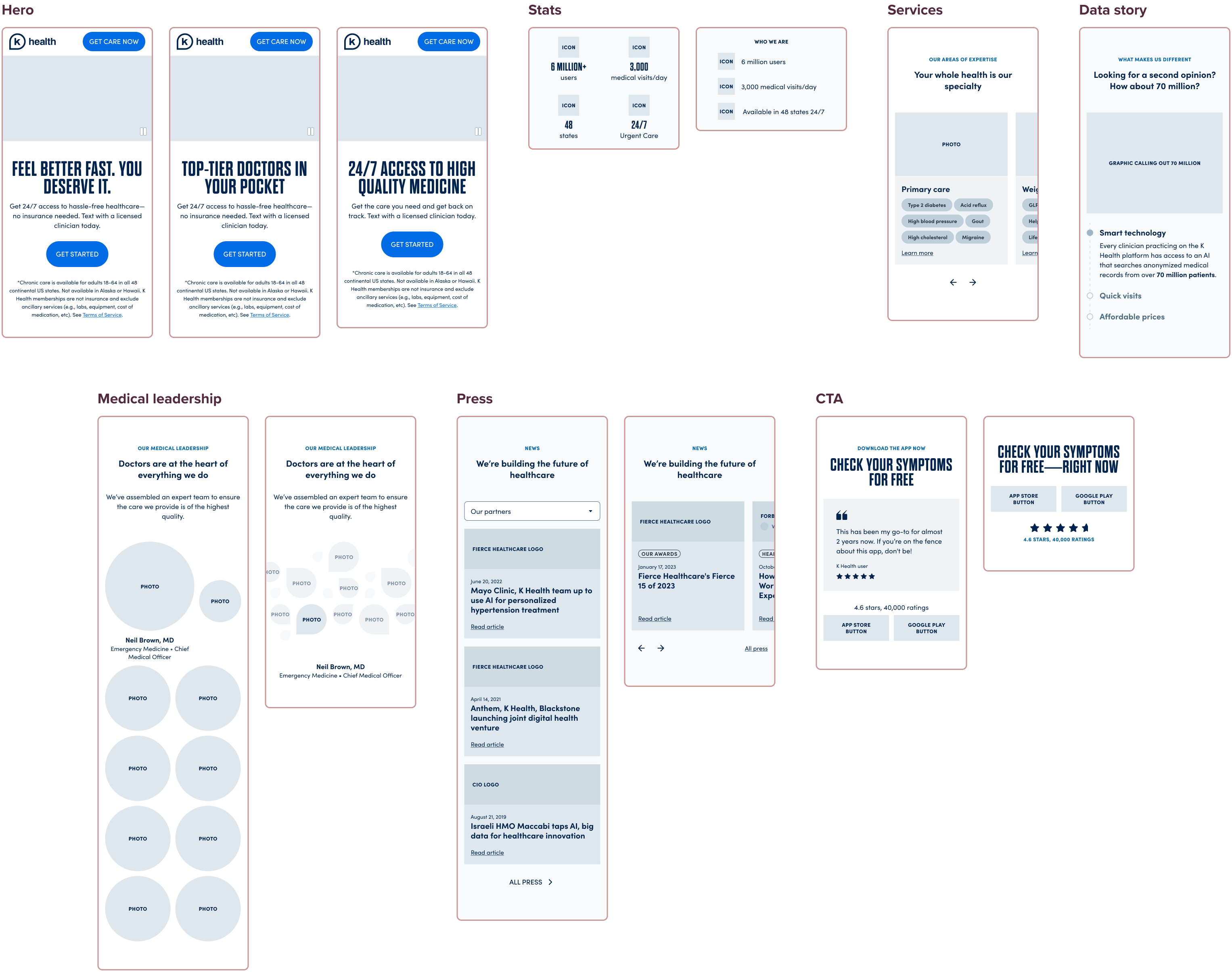
Using a mobile-first approach, the Copywriter and I began by wireframing out potential sections and copy for the page so that we could quickly determine what elements were needed, taking into consideration feedback from the CEO and Director of Marketing. Once approved by all stakeholders, we moved into hi-fidelity design.
Navigation
With the home page updated, we moved on to completely restructuring our site navigation. Research the SEO team did identified that users were heavily interacting with our navigation, which only contained high level pages, such as "Primary Care" and "Urgent Care." These pages were how services were structured on the Product side, but knowing from Product Marketing that users don't identify with these terms, my task was to create a menu that kept these categories, while adding context and surfacing additional pages users would recognize instead, so that a user could better route themselves.
I worked closely with our SEO team to identify which conditions and medications were most searched for by users, as well as to ensure any changes made wouldn't affect our search rankings negatively.