K Health
Brand guidelines
Creating and documenting a fresh identity
Overview
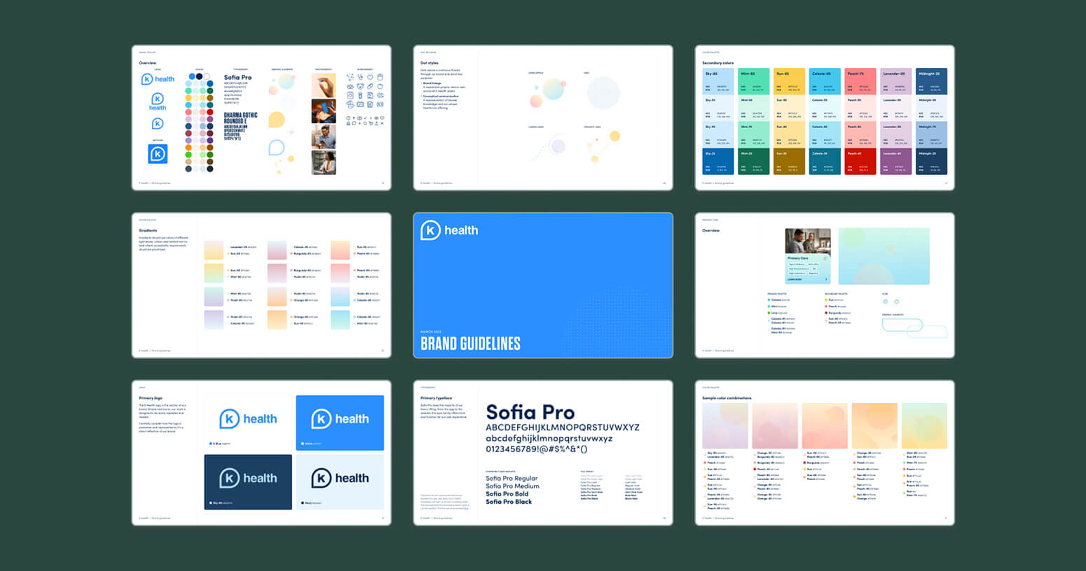
With guidance from the Director of Brand Design, I was tasked with evolving the K Health brand. I designed the following guidelines and all projects showcased within it.

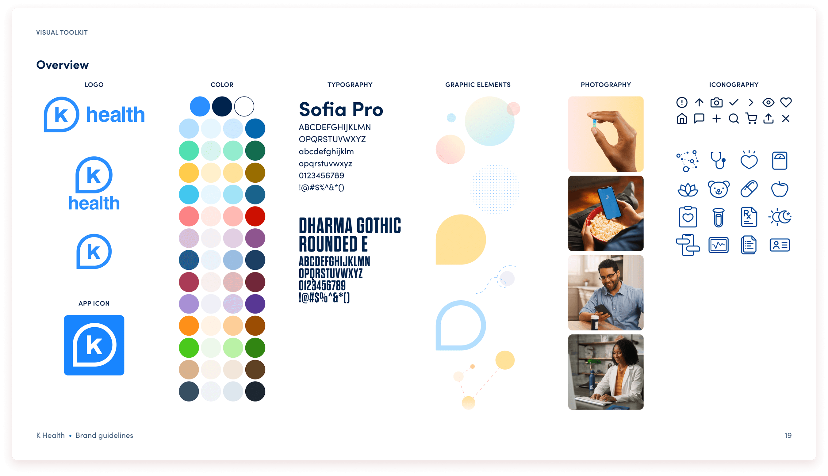
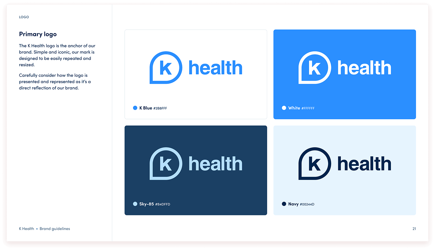
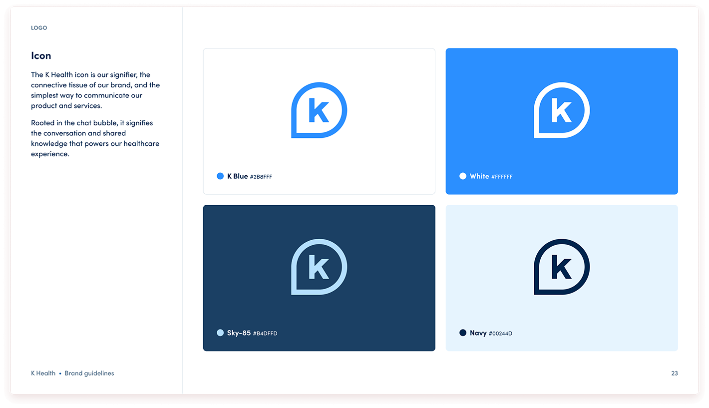
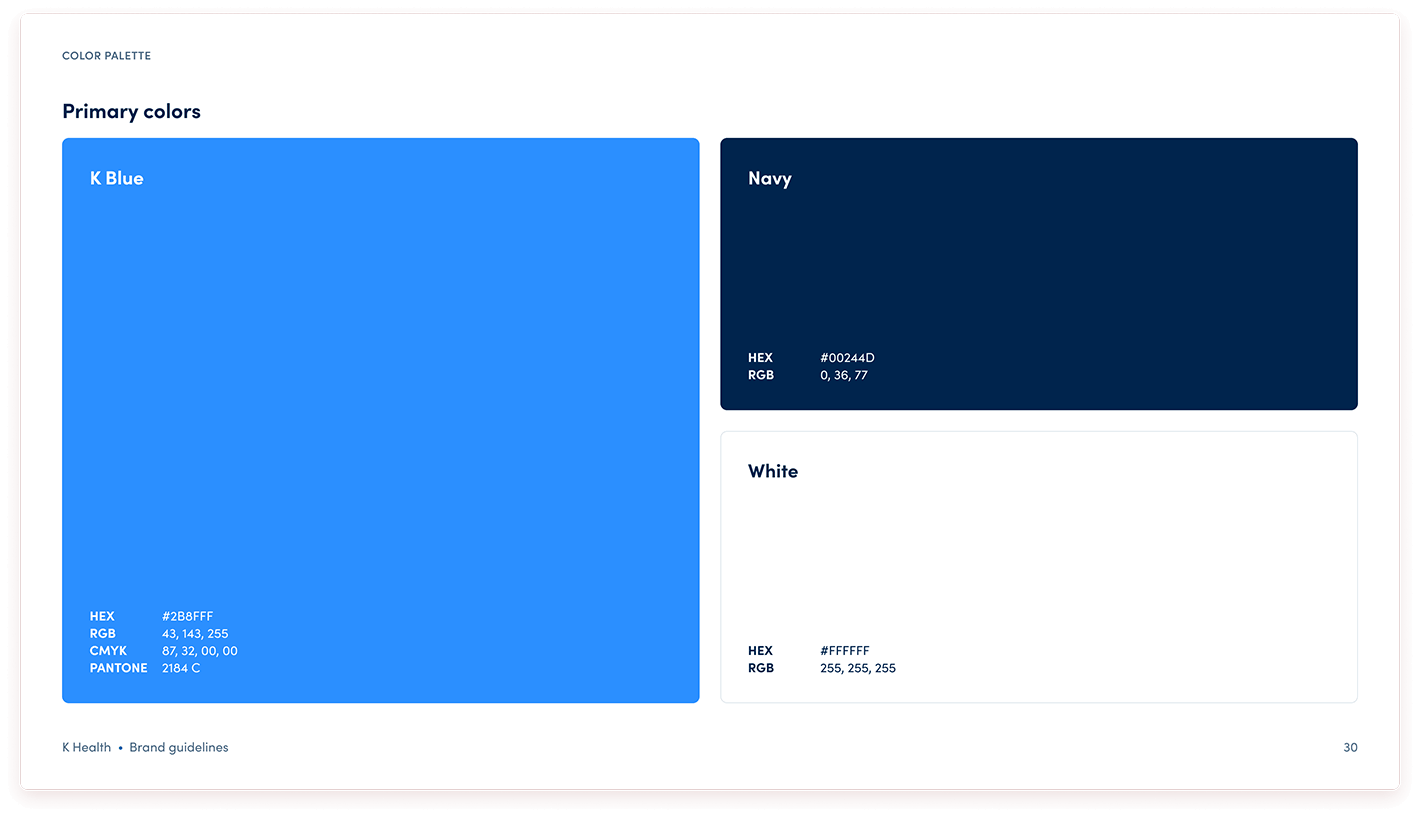
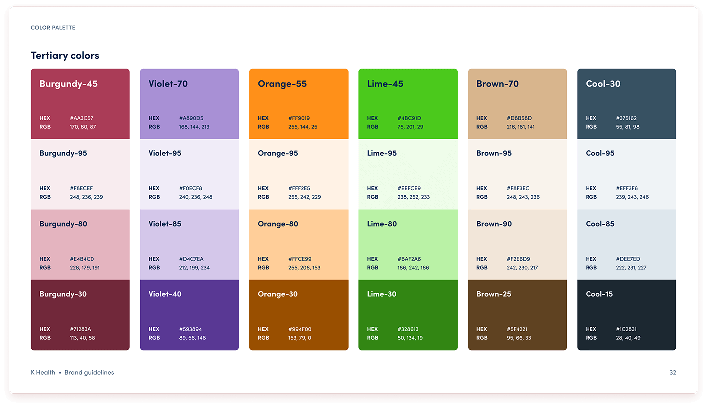
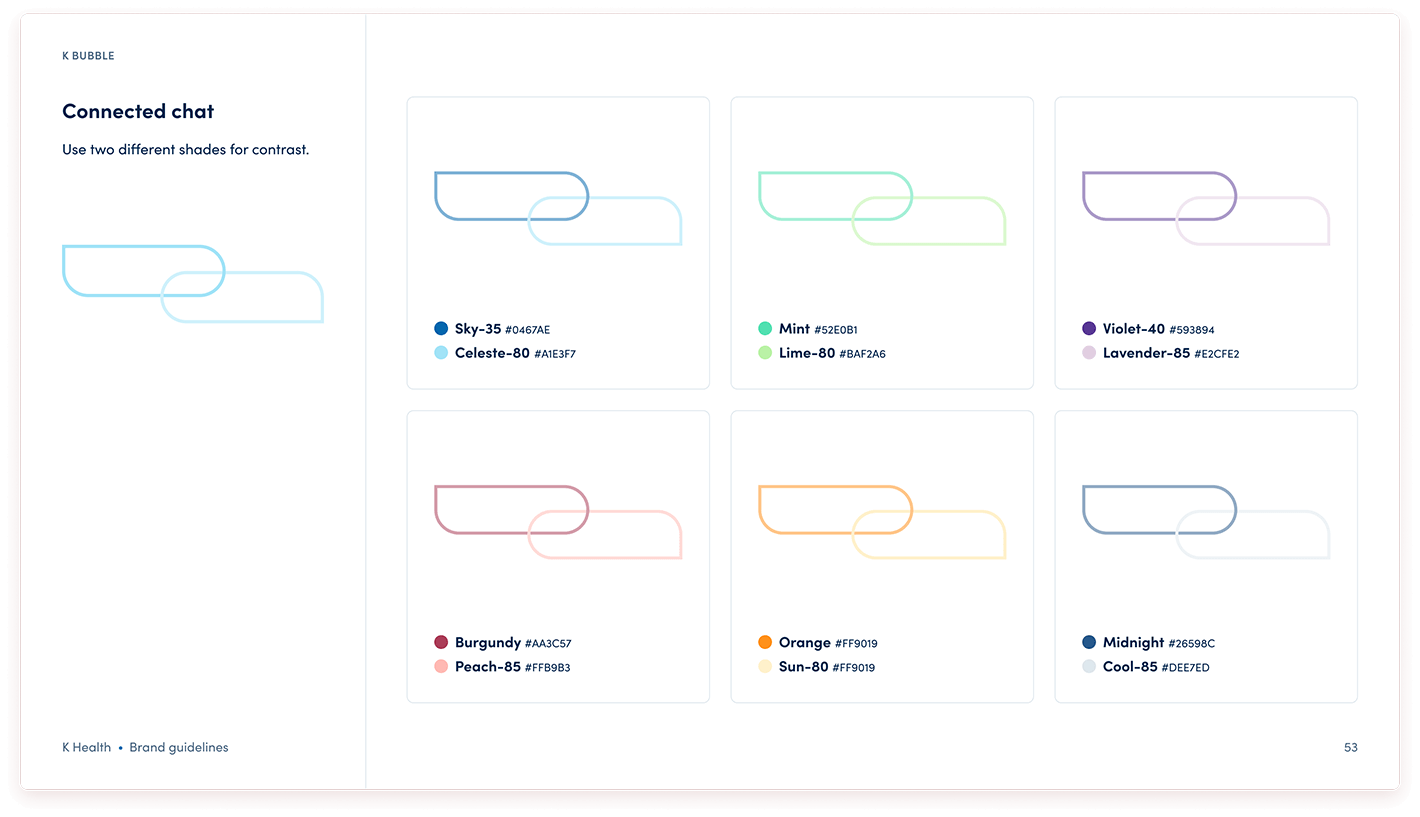
As a defining feature of the K Health brand, the logo didn’t change, but I chose to narrow down the variants and limit the color options to create consistency.

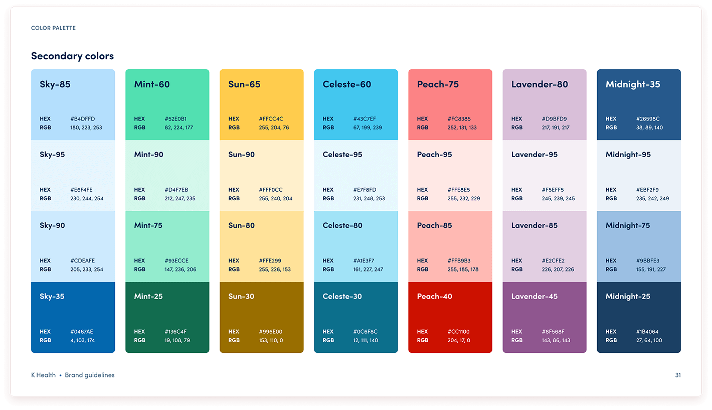
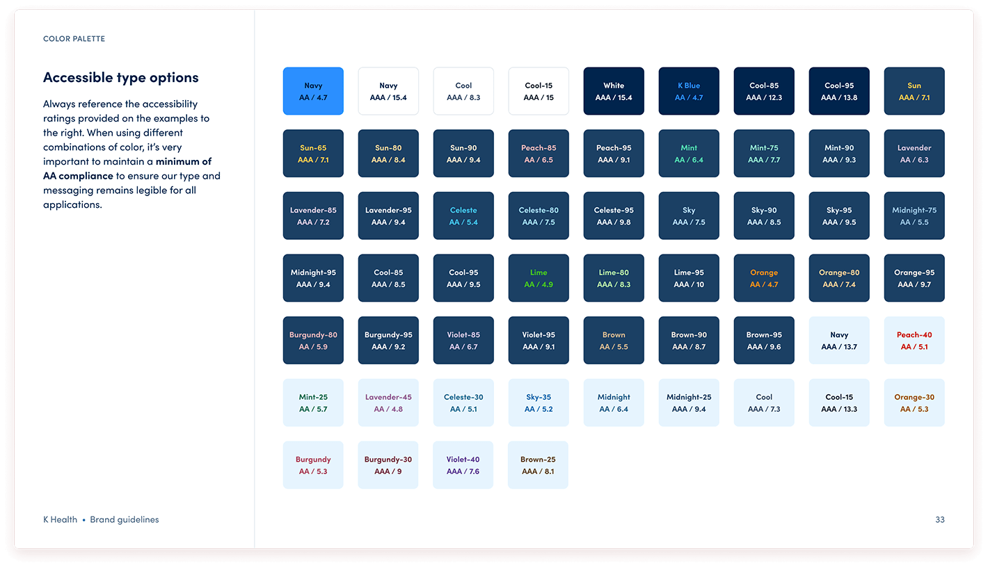
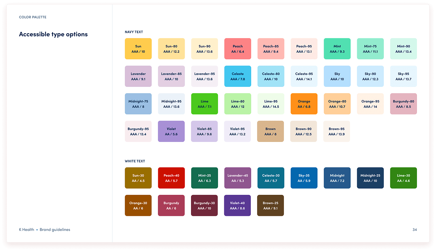
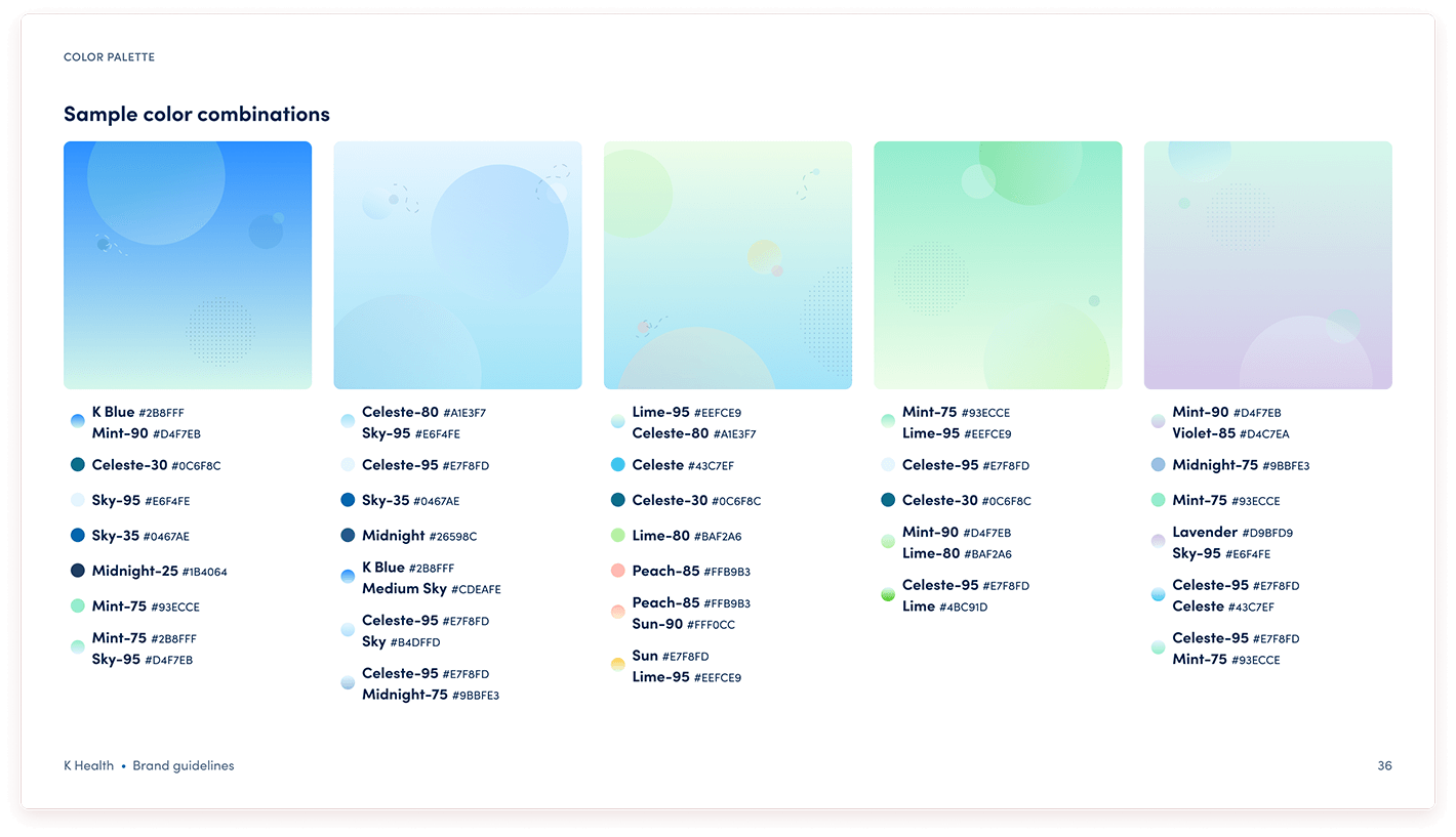
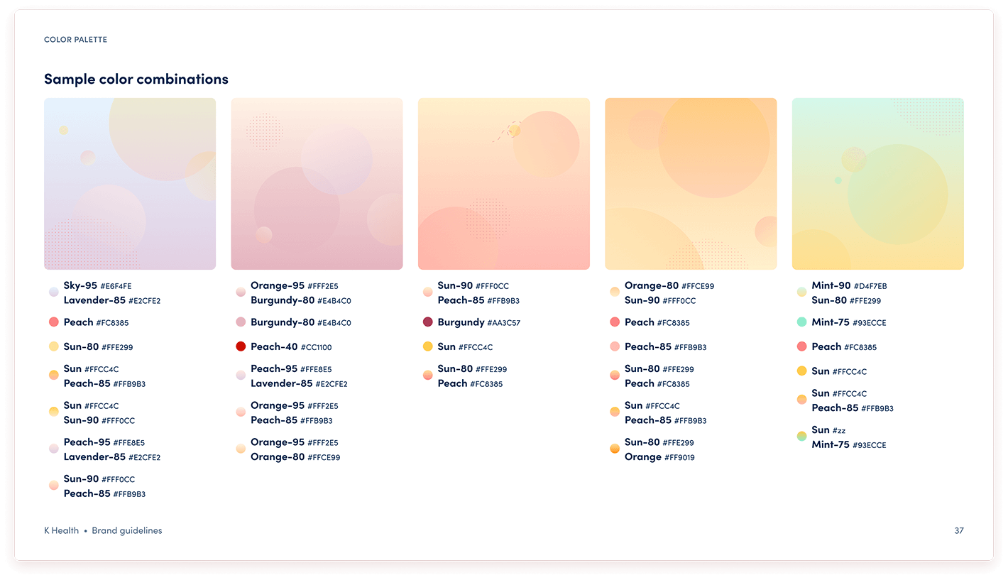
K is commited to accessibility, so I included easy to read charts that allow anyone to quickly choose text colors that have enough contrast.
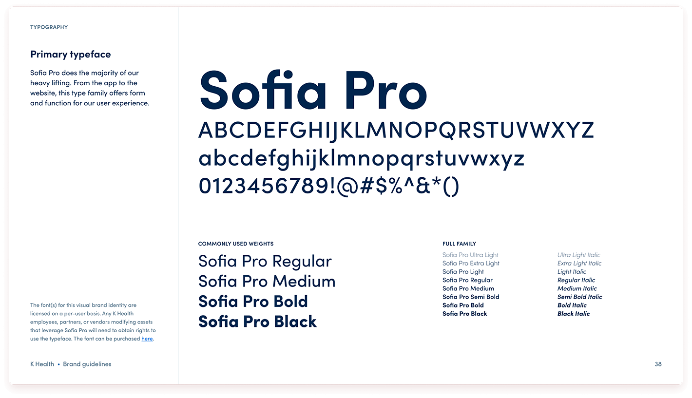
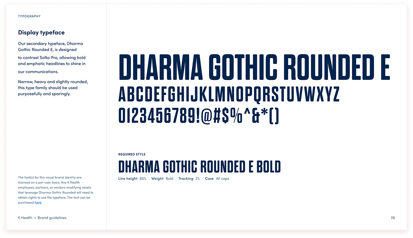
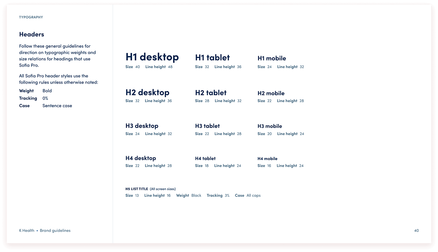
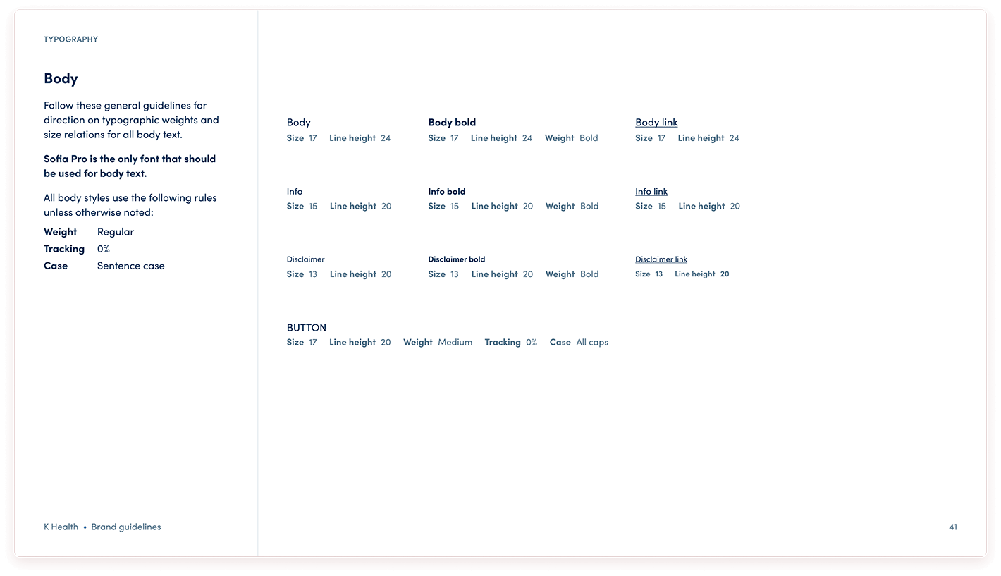
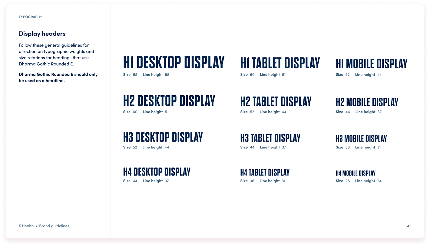
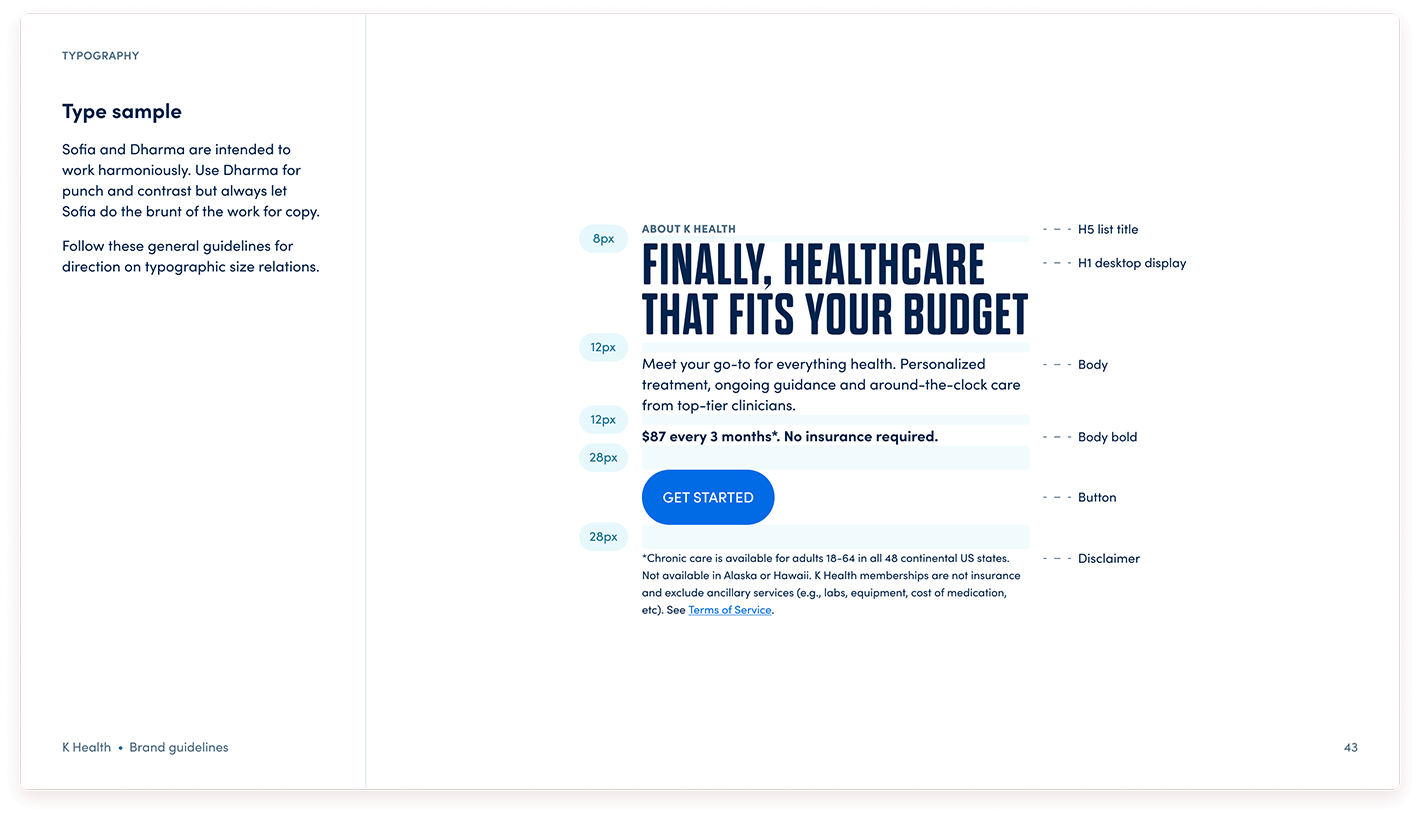
I also developed a new type system in partnership with the Head of Product Design in order to create a system that works across web and app.


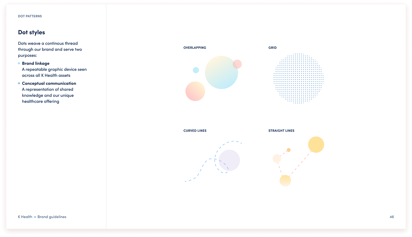


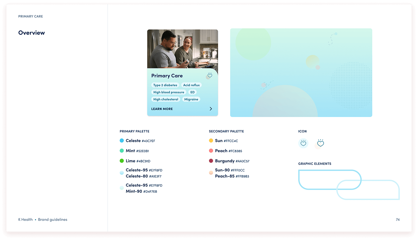
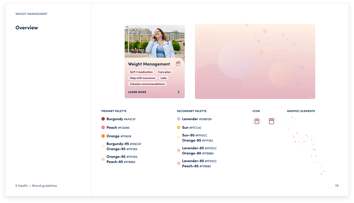
I used the new palette to distinguish K’s services, and created unique dot motifs to echo the use case, like using all downward dots for the Medical Weight Management service.